VISION OF ART
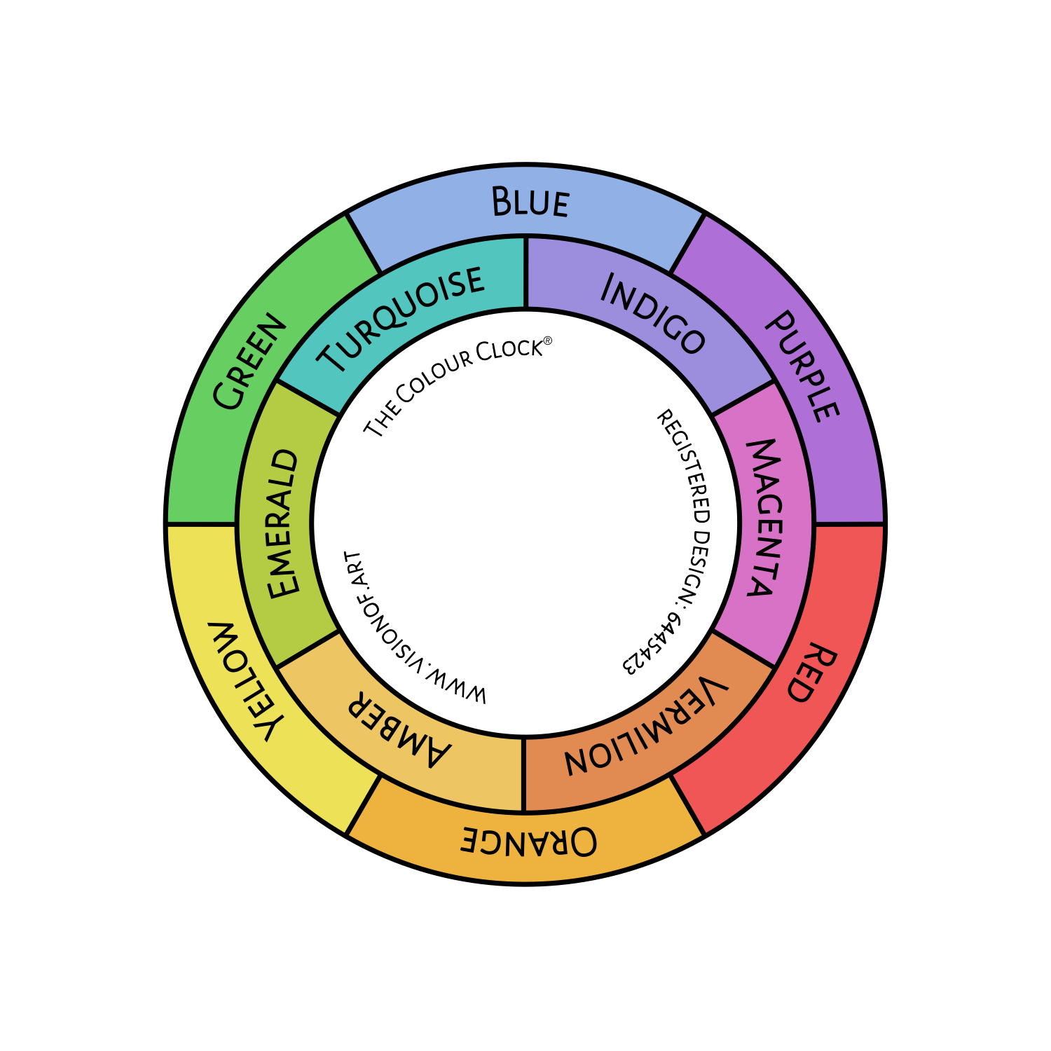
THE COLOUR CLOCK®

The Colour Clock allows you to view the ambient colour of light throughout an environment. Discover how colour can influence the look of light, form and depth.We know warm light creates cool shadows and cool light, warm shadows, but exactly which cool colour and which warm colour, and where do all the other colours go in the meantime?
The Colour Clock helps distinguish the hue of light that falls on objects through space. Like lighter and darker tones help describe the relationship between light and shadow, colour can be used likewise to affect the local colour of objects, helping describe their location within a source of light. Colour builds toward the light.
Using The Colour Clock
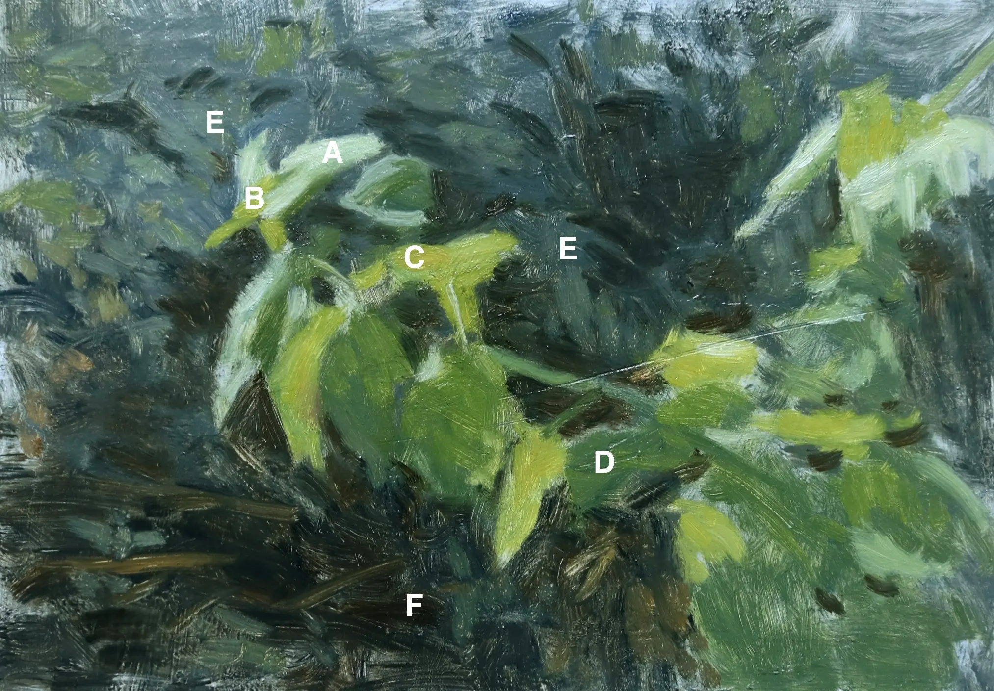
The following example shows how to use The Colour Clock to mix greens, using a palette of raw sienna, yellow ochre, yellow lake, paynes grey, ultramarine.

A: highlight: bluish green (ultramarine & yellow lake)
B: midtone: yellowish green (ultramarine & yellow lake)
C: halftone: orangish green (ultramarine, yellow lake & yellow ochre)
D: shade: bluish green (paynes grey & yellow lake)
E: shadow: purplish green (paynes grey & yellow lake) emphasis on the paynes grey, darker tones are closer to violet.
F: lowlight: reddish purple (paynes grey and raw sienna)
In this example the light source is a cool sunlight, depicted using a green mixed with ultramarine and yellow lake - turquoise on the clock. These two colours are the brighter version of blue and yellow on the palette. Using brighter colours promotes the illusion of light, as colours are brighter in the light than in the dark. Paynes grey is introduced to show areas turning from shade to lowlight, because it is a dull blue in comparison. Yellow lake is used throughout the colour mixes as it most closely resembles the yellow in the local colour of the leaves.
Most parts will need to incorporate a yellow and blue to create the local colour of the subject, using the brighter and duller colours according to proximity to the light will render the illusion of light and shade. Paynes grey in this instance provides colour between dull blue and indigo, the darker in tone the more purplish it appears in comparison to the other blues.
Colour "C" next to colour "D" looks like light on shadow because of the subtle tonal variation and the subtle alteration in colour because of the bright blue in one and the dull blue in the other.
The warmer, duller yellow ochre really helps to give an illusion of warm sunlight (you can also see specks of it hinting at foliage in the lower left), as it steps toward the shadow. Without it, the light looks flat and dull, more suited to a scene in a less brightly lit conditions (more colours from the spectrum indicate more light).
Colour "A", the highlight, isn't hugely high in value but because of the particular colour mix, it looks lighter compared to the other greens, especially when set against the background of shadow colours, which increase toward the red end of the colour spectrum and so naturally emphasise the green. The contrast of values, colours and brightness of the colours themselves, set the elements into position in space. The colours from the clock are introduced into the local colour, enough to resonate against the other elements in the painting.